Back in 2018 I wrote about rewriting my hexagonal grid page. I had said “I'm generally not a fan of rewrites that have no end-user benefits”. I had started that rewrite because the code was making it hard to make diagram improvements that I wanted to make. As a side effect of the rewrite, I also made some performance improvements.
I've been wanting to make some diagram improvements to my A* page. While looking through the code I realized I was in the same situation as with the hex page. It was hard to make the changes I wanted to make because of the abstractions I had chosen. I decided to rewrite the most problematic abstraction, the Diagram class.
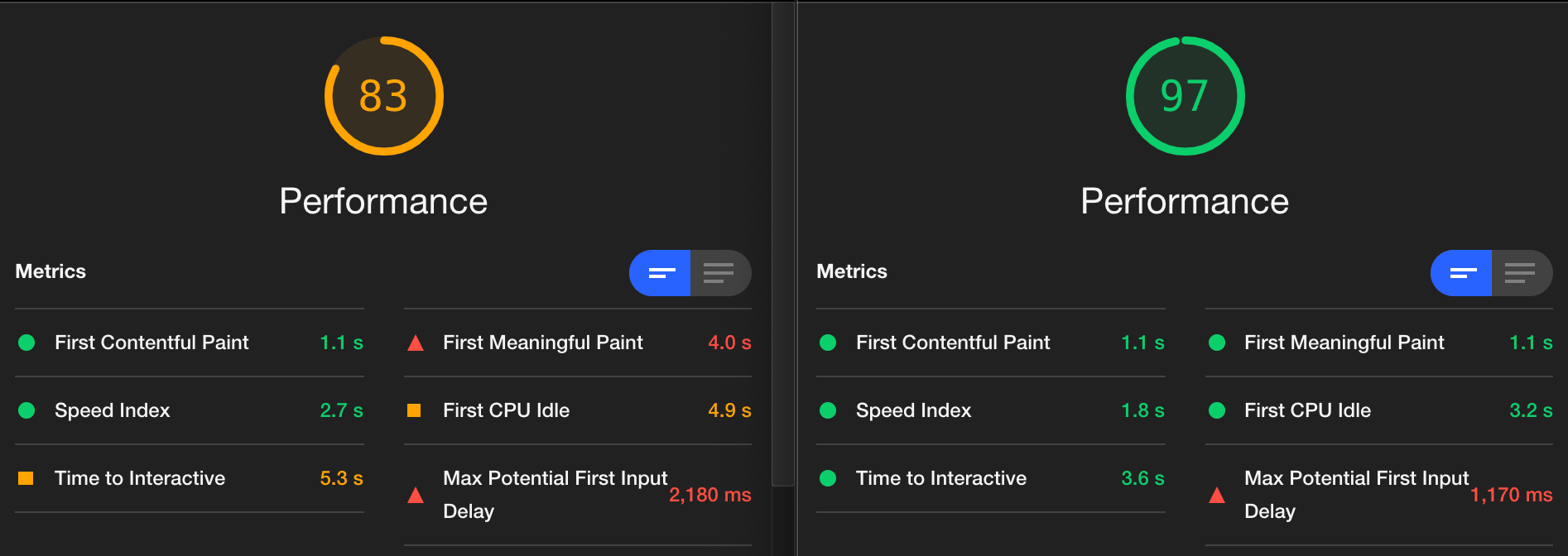
As a side effect of rewriting the Diagram class, I've improved page speed:

It only took a day to rewrite the Diagram class, but it took 5 weeks to get here. Why?!
I had already been comparing different web frameworks to see which one best fit my style of interactive diagrams. Instead of starting with the A* page, which has a lot of diagrams, I decided I'd experiment with a smaller page, “distance to any”. It has only four diagrams.
I generally like Vue, which I had used for the hexagon page rewrite. It has automatic redraw, it works nicely with SVG, it has great documentation, and it has a nice community. However, I wanted to try lit-html too, so I first rewrote the Diagram class in lit-html. It reminded me of all the nice things I had in Vue — automatic redraw, components, documentation, community, html templates. So I also rewrote the Diagram class in Vue. But after the lit-html experience, it made me realize how much of a mismatch Vue is for this project and how many nice things lit-html gave me. It turns out neither one was a great fit for this project.
I decided I should try React, and I also tried Preact+htm. There were pros and cons of each of these but none of them were a great match. None of them made me happy but I eventually decided on Preact+htm. But I was still unhappy, so I put it aside for a week.
When I returned to the project I remembered that there were things avoid implementing because I use SVG. I really like SVG. It's great for shapes and lines and arrows. But there are times I'd like to use sprite art like Kenney's, and it's not a great fit for SVG. It is a great fit for Canvas. So that raised the question: why not Canvas for the pathfinding page?
SVG gives me many things that Canvas does not:
- mouseover effects (you get an event for the whole canvas instead of on each individual svg object)
- dragging an object around, or other changes (have to redraw everything in canvas of only moving that one thing around)
- arrowheads (svg "markers")
- drop shadows (svg "filters")
- change mouse pointer when pointing at a specific object (using css "cursor")
- automatically adjusting for screen density ("hidpi" or "retina")
It's more work to use Canvas. But it'd also let me do more. So I decided to rewrite the Diagram class yet again, using Canvas this time. Even though I had to implement the features that SVG gave me for free, I was pretty happy with the result. The page loads significantly faster, and animations run 2-3 times as fast as before.
I'm finally ready to work on the diagram improvements that I blogged about back in May.
Could I have gone through this process faster? I don't know. Sometimes it just takes time for me to ponder. Sometimes I have to read a lot. Sometimes it takes me writing the wrong code before I can discover the right code. So I don't consider it a complete waste to have read so much and rewritten the page four times. I think part of that was necessary to get to where I wanted to be.
Labels: canvas , making-of , pathfinding
Post a Comment