Every once in a while I revisit my pages to see how I could improve them. This is one of the reasons I prefer text to video: I can keep improving it instead of treating it as "published" and then never changing it. I have been updating some of my pages for over twenty years. I started thinking about the Introduction to A* page again when I read a page about online interactive learning and a page about the expertise reversal effect. I made a list of some things I could improve in my diagrams, but also why I had done them the way I did.
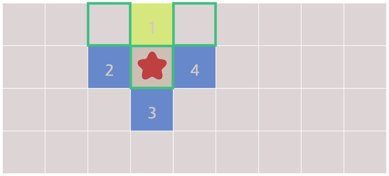
Path reconstruction diagram
As I wrote in 2016, the path reconstruction diagram shows some code and a diagram, and the two should correspond. They do, mostly. The start and goal are identified by icons in both the diagram and code. The path is shown in the same color in diagram and code.
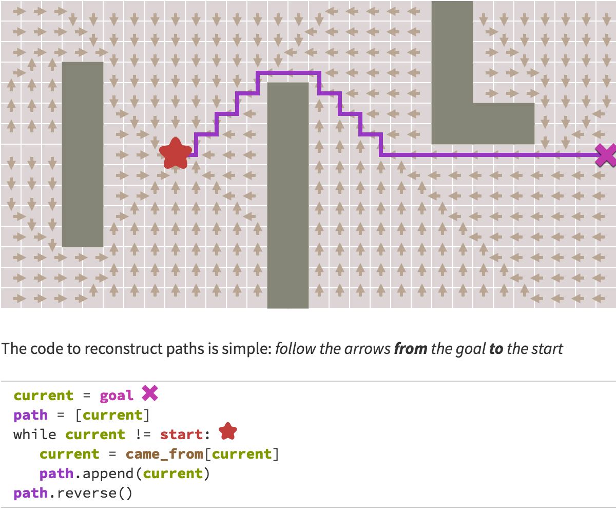
There's one thing missing though. The current
variable is in the code but not the diagram. It's a loop, so it should show up as an animated dot moving along the path.
This would help emphasize that the path reconstruction works backwards, from goal to start.
Why didn't I implement this?
It's in large part because I didn't have any other diagram with animations, so I never implemented an animation system for this page. I reused the diagram abstraction I had written. I was proud of the layered approach I implemented and how I could express all the diagrams with it. I didn't even realize that this diagram could've been better, because I was thinking in terms of making the best diagram I could with my diagram abstraction, rather than making the best diagram I could for the reader.
I don't know whether I'll improve this diagram. It's "good enough for now".
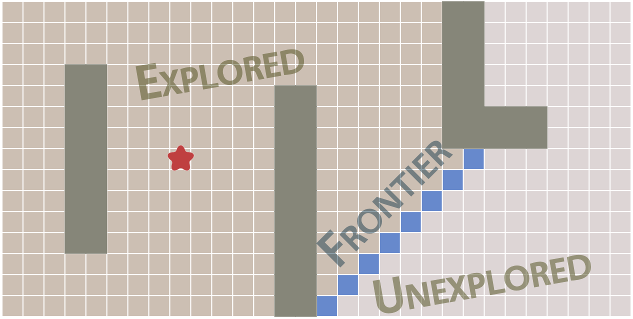
Frontier expansion diagram
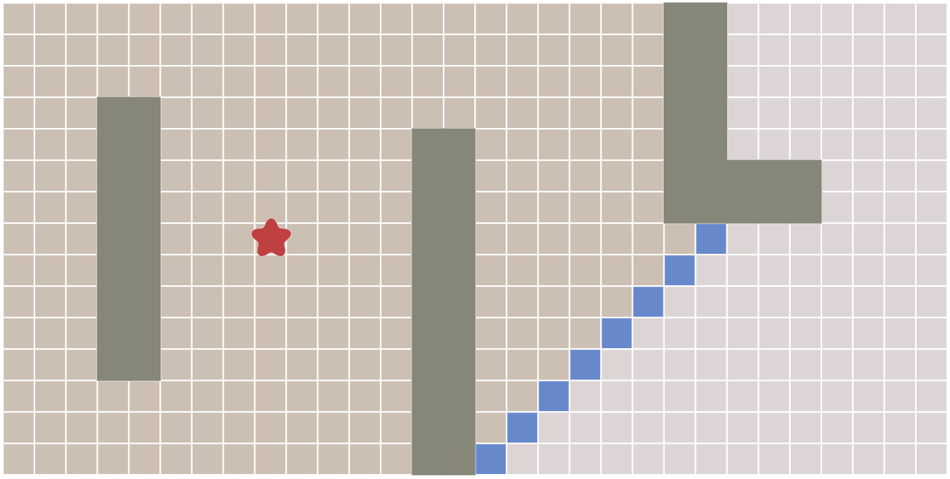
This shows the state transitions for graph search. Nodes start out unexplored, then go into the frontier, then become explored. The description of the frontier is in the paragraph above the diagram. You have to run the animation to see the unexplored→frontier→explored changes.
Back when I wrote this page, I wanted every diagram to be interactive. I had convinced myself that interaction was always better. Since then I've realized that interaction makes some things worse. Consider what I would've done if I were making a static diagram here. I would have put labels on the diagram itself:
I might've also added arrows showing how the frontier is moving through the map. You can see the movement with the animation, but labeling the interactive version is hard, so I didn't do it. It's not clear to me whether this diagram would've been better static with labels or interactive without labels. If most readers don't interact with the diagrams, making this interactive has made it worse.
Even if I keep it interactive, the slider/animation are tied to the outer loop of the graph search algorithm. That's probably not the right level of granularity. Instead, the animation should be tied to the distance from the start.
Why didn't I implement this? It's because I'm reusing a diagram abstraction for all the diagrams on the page. That generic diagram abstraction has a slider tied to the outer loop of graph search because that's something that works across all the algorithms. Distance would only work for the breadth first search diagrams, including this one.
Instead of implementing the best diagram for the reader, I implemented something that fit the abstraction I had implemented. Even worse, I didn't even realize how that abstraction had led me down the wrong path. I was implementing the best diagram I could given the abstraction, rather than the best diagram for the reader.
I don't know what I should do with this diagram. Should I make it static? Should I show labels on the initial diagram but hide them once anything is changed? I'm undecided.
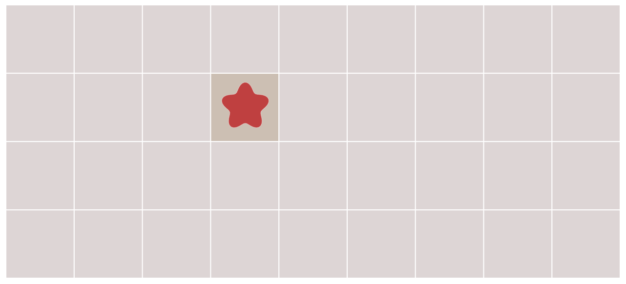
Neighbor visiting diagram
For most of my diagrams, I've tried to make the initial state show something without interaction. That way, interaction is optional. For this one though, the initial state isn't informative:
If you go forward one step, you get to this:
There's a lot going on in this diagram! The initial node has turned brown; there are green squares; there's a yellow square; there are blue squares; there are numbers. What does all of this mean?
The first diagram is neither inviting nor informative. The second diagram is overwhelming. This diagram is the worst on the page.
Here too the problem is the abstraction. I had a diagram abstraction with a slider tied to the outer loop of graph search. This diagram is a "deep dive" into the way the algorithm works. Instead of being tied to the outer loop, it should be tied to either the inner loop, or to the line number. For example, here's an experiment in having the reader run the algorithm themselves instead of letting the algorithm control what happens. The diagram shows a connection to the data structures and the code. That experiment didn't handle everything well either but it's an example of what I might explore if I didn't limit myself to the reusable diagram abstraction.
I don't know how to fix this diagram but I know that I don't like it.
Conclusion:
Back when I made the A* page, I wanted to come up with a clever abstraction that could implement all the diagrams on the page. This worked for most of the diagrams, but several diagrams were worse off because I tried to fit them into the abstraction instead of making the best diagram that I could. Abstractions, generic code, reusable code all make me happy! But they sometimes take me down the wrong path. It's not until I've been away from the implementation for a while before I realize how much the abstractions have shaped the result (Sapir-Whorf?).
Even worse, back then I wanted abstractions that I could reuse across many of my pages. This makes it harder to change any of them. I would've made more improvements over time if I had copied & pasted code. I'd like to improve the Introduction to A* page but haven't decided yet what I'll do. Do I work within the abstraction? Do I break the pages apart into small independent projects, so that I can iterate on each one quicker? Do I make one-off diagrams that don't share much code? I haven't decided.
Post a Comment