One of my goals this year is to iterate more. I have a tendency to "launch" a page and then move on to the next topic. Instead, for the first few months of the year I decided I would go through my existing pages to:
- figure out how the content could be better (explanations, diagrams, user interface, little details)
- figure out how the tech could be better (load time, animation code, diagramming code, code structure)
Over the past 6 weeks I've been working on my guide to hexagonal grids. I first worked on the tech, switching from an imperative style to a declarative style, and also switching to a library with automatic dependency tracking. Then I worked on content updates, some of which I described in my previous blog post. In the past week I've been going through my list on trello and implementing more content updates:
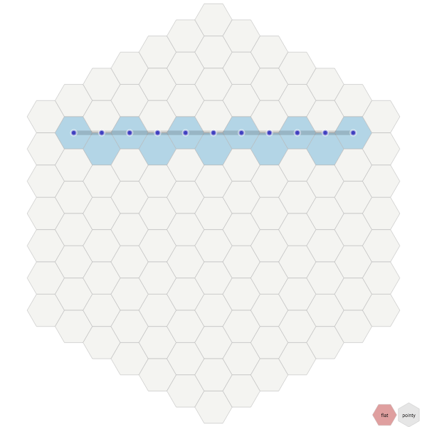
- Angles diagram: added the circumcircle to show that the corners are always on a circle; added dots on the corners to emphasize this; changed the 6 sliding angle labels (30°, 90°, etc.) into 12 static angle labels; fixed a bug in the angle calculations.
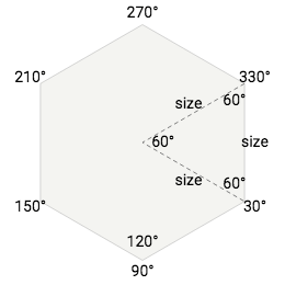
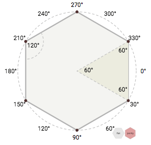
Angles diagram: before and after - Size/spacing diagram: added arrows showing the horizontal/vertical size or spacing, on mouseover
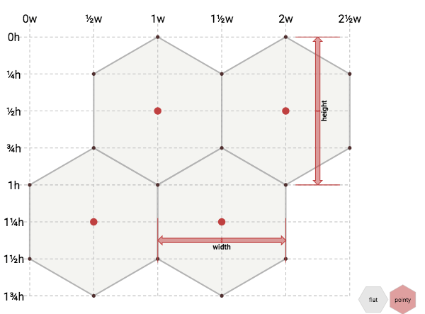
Size/spacing diagram: arrows - Line drawing diagram: fixed a bug that my rewrite reintroduced (oops!), and that the article even tells you how to fix.
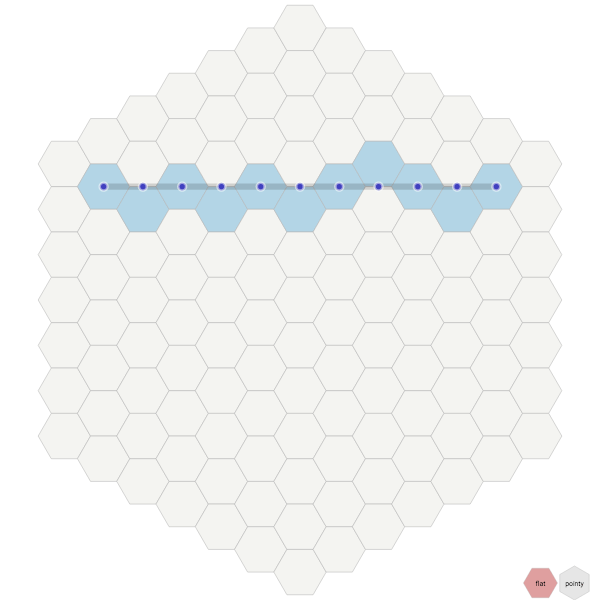
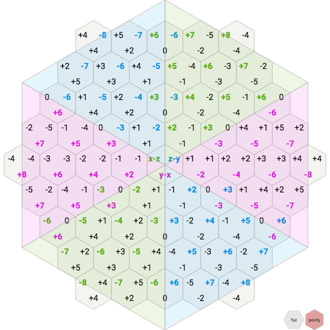
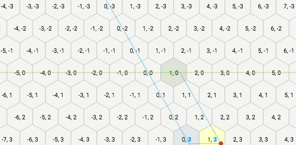
Line drawing diagram: before and after bug fix - Many diagrams: show values with signs:
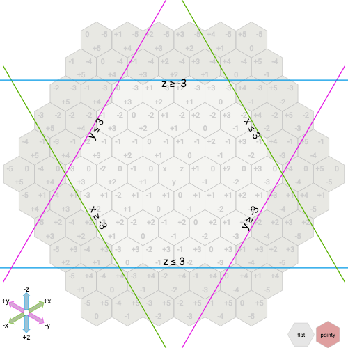
+N,-Ninstead ofN,-N - Cube coordinates, axial coordinates, coordinate range, rotation diagrams: added a legend showing the axes, because it's easier to understand those coordinate systems and algorithms when you can see the axes. The axes themselves are the same ones as in the axes section, which I'm considering removing.
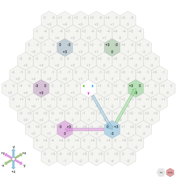
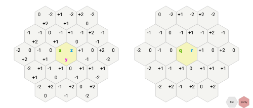
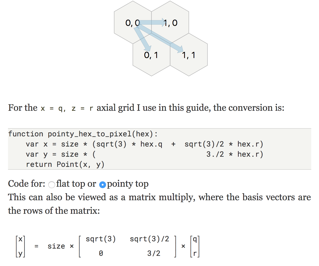
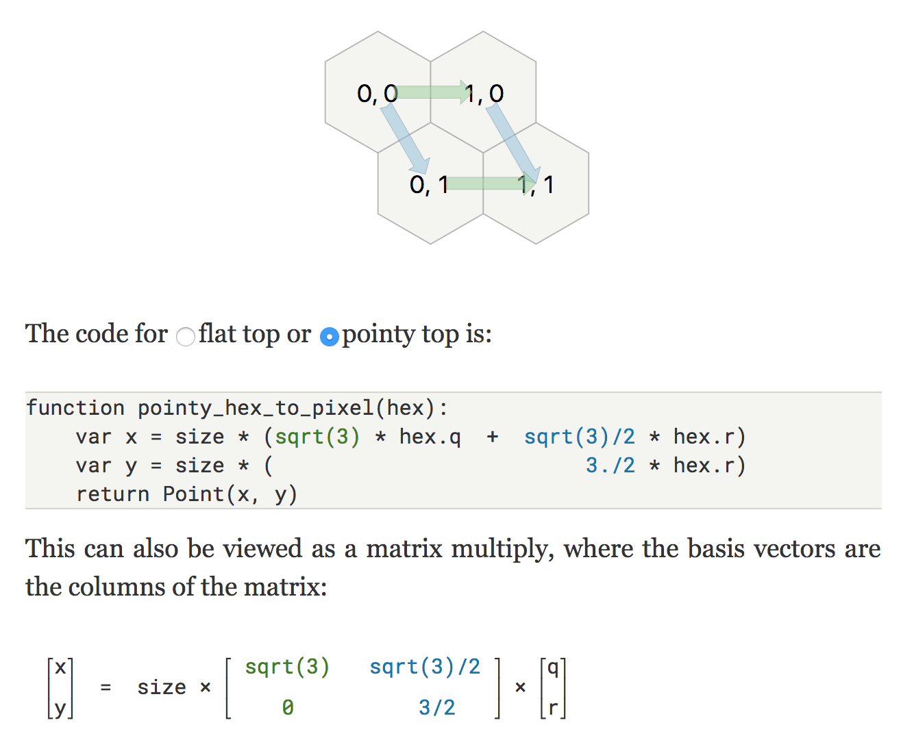
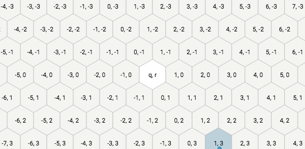
Several diagrams: axes legend in lower left - Axial conversion, offset conversion sections: added diagrams to visually show what the pseudocode was computing, with side-by-side grids with two different coordinate systems. If you're implementing your own code for conversion, you can now use these diagrams to get reference values for your test cases.
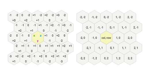
Conversion sections: new side-by-side diagrams - Distances diagram: this had too much color to be readable, so I removed most of the color, and highlighted one distance at a time. I'm still not happy with it but it's easier to read than before. More iteration needed.
Distances diagram: before and after - Library code: rearranged code so that I can reuse the hex library and diagram code on more than one page. Changed the implementation page to use the same code as the main page.
- Direction diagrams: the old super-colorful distances diagram also doubled as a way to see that each of the six wedges has its own properties. Since the new diagram is no longer colorful enough to see this, I made a separate page for this. This was a test case for being able to make multiple pages that share the diagram code.
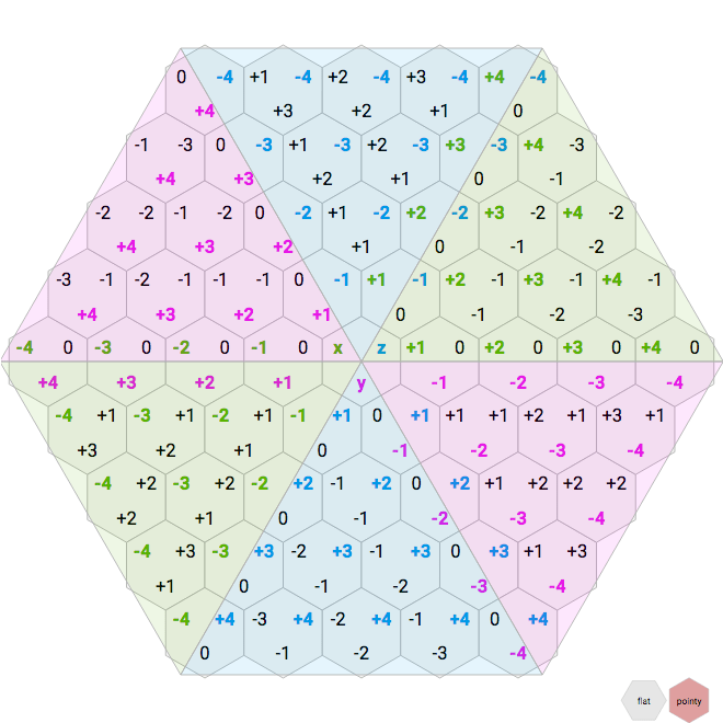
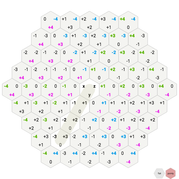
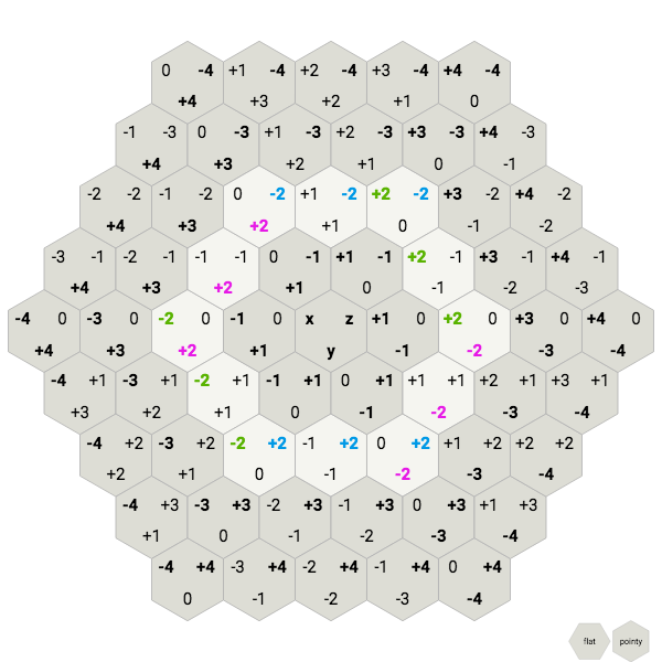
Direction diagrams - Many diagrams: changed the highlight color from medium blue to yellow to increase contrast of labels, and make them easier to read. Also, blue is used for
x,q, andcolcoordinates, so using also blue as a highlight color led to some ambiguities. For example, in the map storage diagram, I used to highlight the row in blue, even though rows are usually green. Now the row is green and the hex is yellow. - Hex-to-pixel diagram: added color to the basis vectors in the diagram, the code, and the matrix, showing that basis vectors are key to this algorithm.
Hex-to-pixel: before and after - Pixel-to-hex diagram: since pixel-to-hex is the inverse of hex-to-pixel, added the same colors to the diagram, the code, and the matrix; showed that the pixel-to-hex matrix is the inverse of the hex-to-pixel matrix. This is another example of how the blue highlight is misleading, and how yellow won't be confused with one of the basis vectors.
Pixel-to-hex diagram: before and after
I'm quite happy with how much easier these changes were to make with the new declarative code compared to the old imperative code. I had wanted to make some of them before, but it was a lot of work with the old code structure, so I never got around to them.
This week's project is to work on load time. Both the hexagon guide and the A* pages load far too slowly. The main reason is that the diagrams are generated after the entire page loads. I'd like to generate the initial diagrams on the server and send them to the browser. That way they're already there before any Javascript is parsed or executed. However, my old imperative code structure made this a lot of extra work. The new declarative approach should make this easier to implement.
Thanks for all this.
Post a Comment