Back in April I wrote about some pathfinding diagrams I was unhappy with. Last month I wrote about reimplementing the diagramming code.
I started with the Tower Defense page. It's smaller than the A* page and I wanted to try out some ideas there before adopting them on the more popular page.

The introductory diagram shows an animation of what we want: a flow of objects towards a specific goal. The next diagram is intended to give an idea of how we get there. There are two related concepts: distance fields and flow fields. The old diagram (above) showed only the distance field numbers. I wanted to show the flow field as well. These two are related — the flow field is the gradient of the distance field:
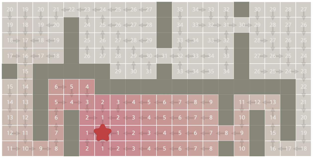
Colors: I was unhappy about the number of colors I was using, and also that each tile can have multiple independent states. I was using color for visited/unvisited, frontier, current, neighbors, next, and plains/forest/water/wall. That's too many different types of information to have in a single color channel. And there are already too many colors. What to do?
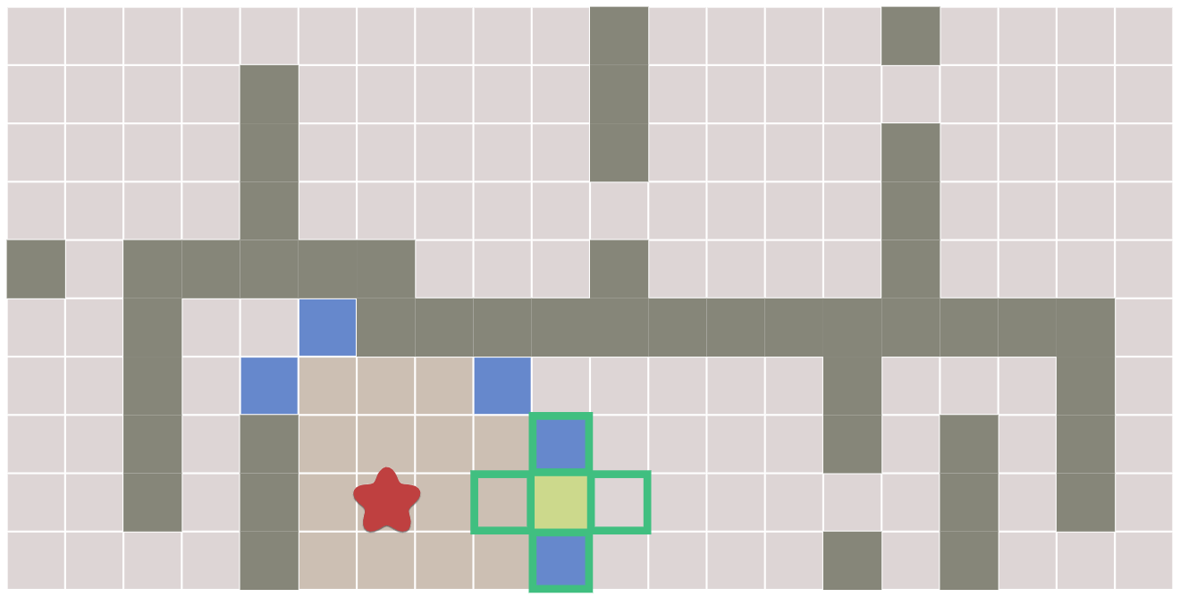
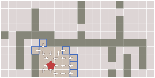
After some experimentation, I decided to move the frontier/neighbor information to the outline of the tiles. In doing so, I reduced the number of colors. In the old diagram, I had beige for unexplored, brown for reached, gray for wall, blue for frontier, yellow for current, green outline for neighbors. A tile could be three states at once: reached and frontier and neighbors. I liked neighbors being an outline:
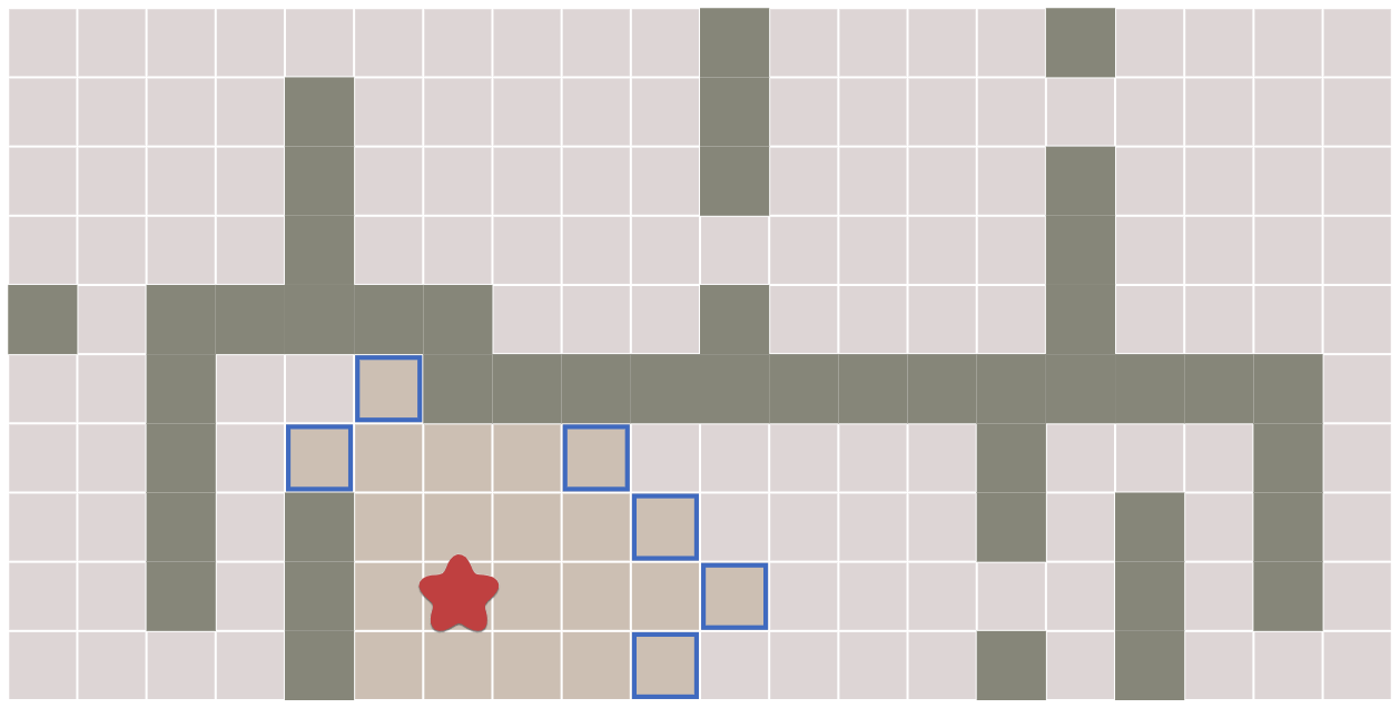
I decided to first introduce the frontier as outlined tiles, without neighbors and current. This lets you see that the frontier tiles are considered reached.
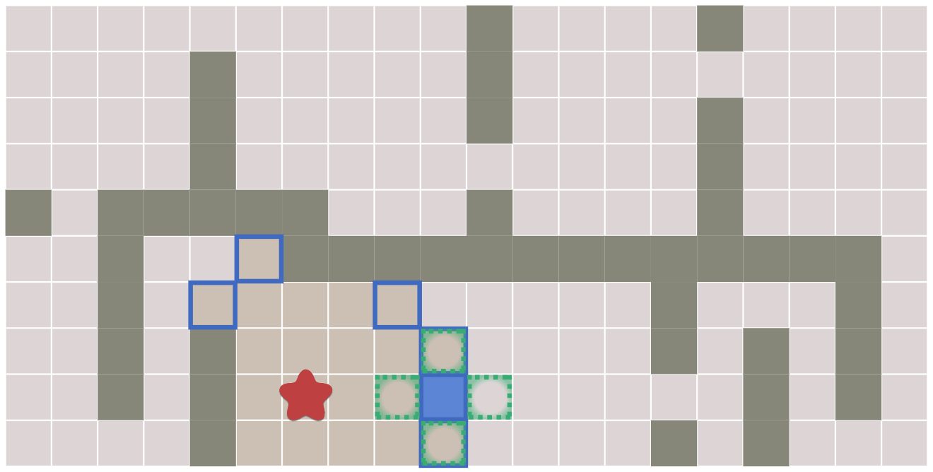
In a separate diagram I introduced neighbors. But because the frontier is using the outline color, I made neighbors a dashed outline with a slight gradient. I changed the current tile from solid yellow to solid blue, because current is chosen from the frontier set, and I wanted the colors to correspond. I don't know if anyone will pick up on that in this diagram though.
In a later diagram showing flow, I had been showing neighbors and the current node, but those are kind of irrelevant at that point. I removed those so that the reader can focus on what's important:
I was happy with my changes on the Tower Defense page, so I moved on to the A* page. See part 2.
Labels: design , making-of , pathfinding
Post a Comment