In the last post I described improving the diagrams on my Tower Defense page. Once I finished that, I moved on to my other pathfinding pages, starting with the A* page.

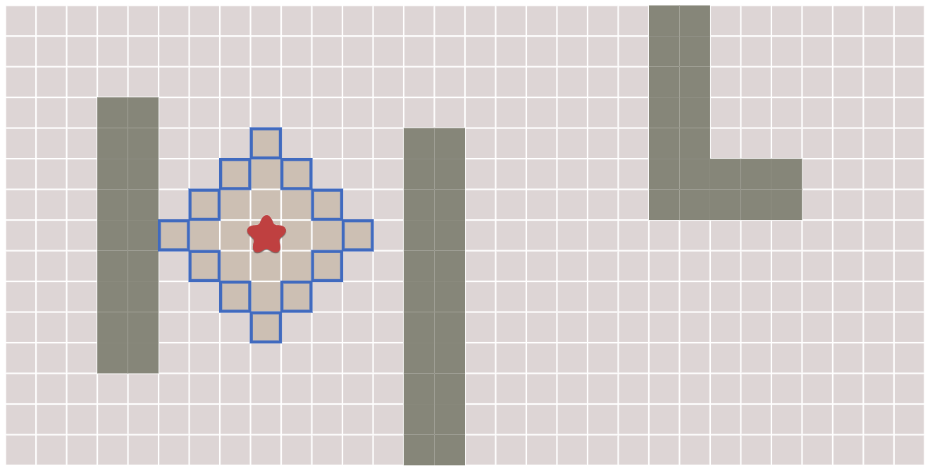
Frontier expansion diagram: I didn't find a good way to put labels on the dynamically generated diagram so I created a static state transition diagram and placed it in the text. I using inline legends, which describe in the text the shapes that I'm going to use the in the diagrams. The above is example showing some frontier nodes, unexplored nodes, and reached nodes. I also used colors that match the colors in the diagrams.
I used the inline legends to describe the state transitions:

I think it serves a separate purpose from directly showing labels on the diagram. These are meant to prepare you for the animation, whereas the labels would serve to annotate the animation.
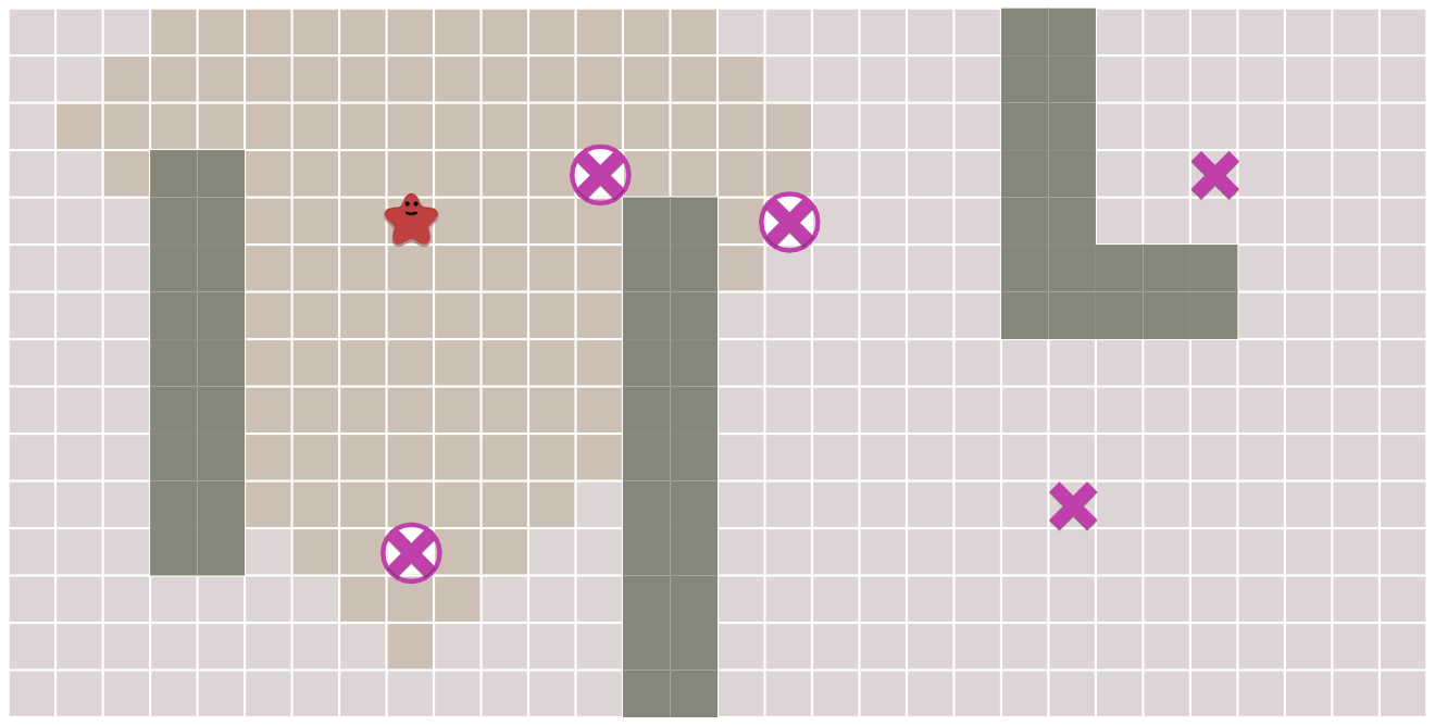
Frontier expansion diagram: I had implemented all the diagram animations to match the code. However early in the explanation, the reader hasn't seen the code yet. The frontier expansion diagram should show the concept of an expanding frontier, not the implementation of it.
I decided to change the slider from number of loop iterations to distance from start. The new animation feels smoother and easier to understand. I posted a comparison of the animations in this tweet.

Early exits: I was planning to add a few more examples of what you could do with early exits. This ended up longer than I wanted to include on the A* page, which is already pretty long, so I put it on its own Early Exit page, and linked to it from the A* page.

All pairs: This was an incomplete page from back when I was writing all the pathfinding pages. The A* page was meant to be one source one destination. The Tower Defense page was many sources one destination, or one source many destinations if run in reverse. And the All Pairs page was meant to be many sources many destinations.
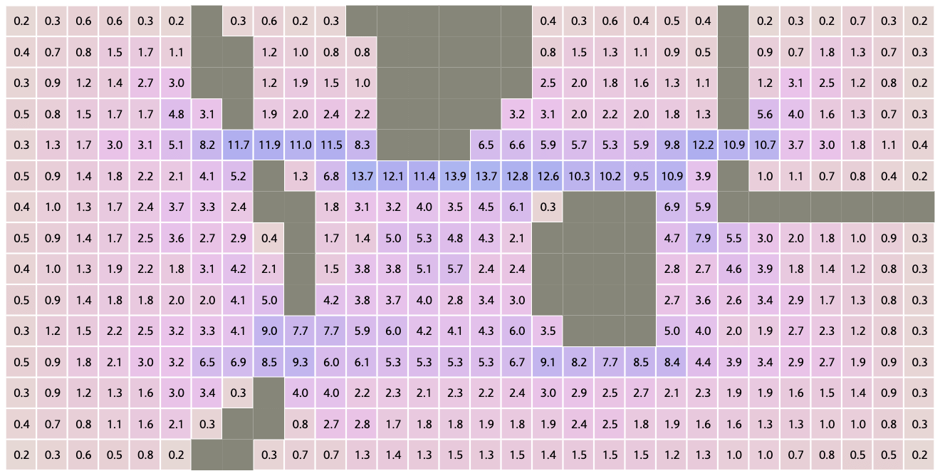
I had implemented the Floyd-Warshall algorithm for all-pairs shortest paths. I had one example problem: find all pairs of paths and then see which tiles are used most often. However, it ran too slowly for this page to work well.
This is one of the struggles I have with making everything interactive. Some algorithms just won't run fast enough to demonstrate effectively.
Since I had good luck with Breadth First Search in mapgen4, with the code running at over 1 million nodes per second, I decided to try it here. Running Breadth First Search hundreds of times was far faster than I expected. The calculation time went from 400ms to 14ms!! It now runs at interactive speeds!

Now that I'm no longer blocked by the algorithm performance, I want to work on this page. Try the first diagram and let me know if you have ideas for more diagrams to add.
Miscellaneous improvements: Lots of my experiments didn't work out, but I kept a few:
- I changed most of the sliders to use a dynamic range. Ideally the slider minimum should be 0 and the maximum should be the last time when something changes on the diagram. The problem is that I implemented the search algorithms to exit early. That means I don't know the last time when something might change. Fortunately for most diagrams I can calculate this in a different way. There's one diagram where I can't easily calculate it without running search twice, once without early exit and once with, so I didn't implement the dynamic range there.
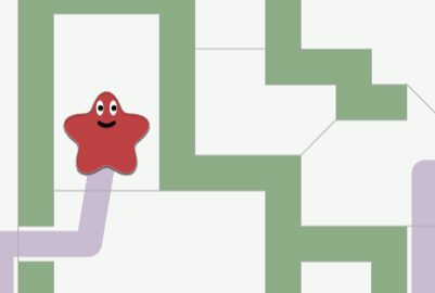
 I've long wanted to add faces to my blobs. I've been experimenting with procedurally generated cartoon faces since 2011 or maybe earlier. In my most recent experiment from 2018, I got the mouth working nicely, and I used that in 2019 to regenerate my blob logo. I still haven't worked on the eyes though. I'd like to make blinking attentive eyes. I decided I should put static faces in now instead of waiting until I have everything working.
- One reason I generally use SVG instead of Canvas is that many effects are much easier to implement. One of those is cursor feedback. I can update a tiny part of the SVG, and the browser will figure out what to redraw. Sometimes I don't even need an event handler, such as when I use CSS :hover to add a drop shadow. When I rewrote these diagrams into Canvas, I lost the visual feedback, so I went back and implemented a visual feedback system in code instead of in SVG+CSS. It's a lot more work in Canvas but for this page it was worth it.
The new diagram class has been a joy to work with. It has so much easier to work on diagrams than with my old code. The old diagram class was premature abstraction. I wrote it and then wrote the diagrams to fit the abstration. The new diagram class is based on my experience making the diagrams. The abstraction fits the needs of the project.
Labels: design , making-of , pathfinding
Post a Comment