In part one, I described how I was making a new diagram for my hexagon grid guide, but that I didn't know how to evaluate the design choices I had to make. In part two, I described how I looked at the introductory section of the page to decide the purpose of the new diagram and how it fit in with the others.

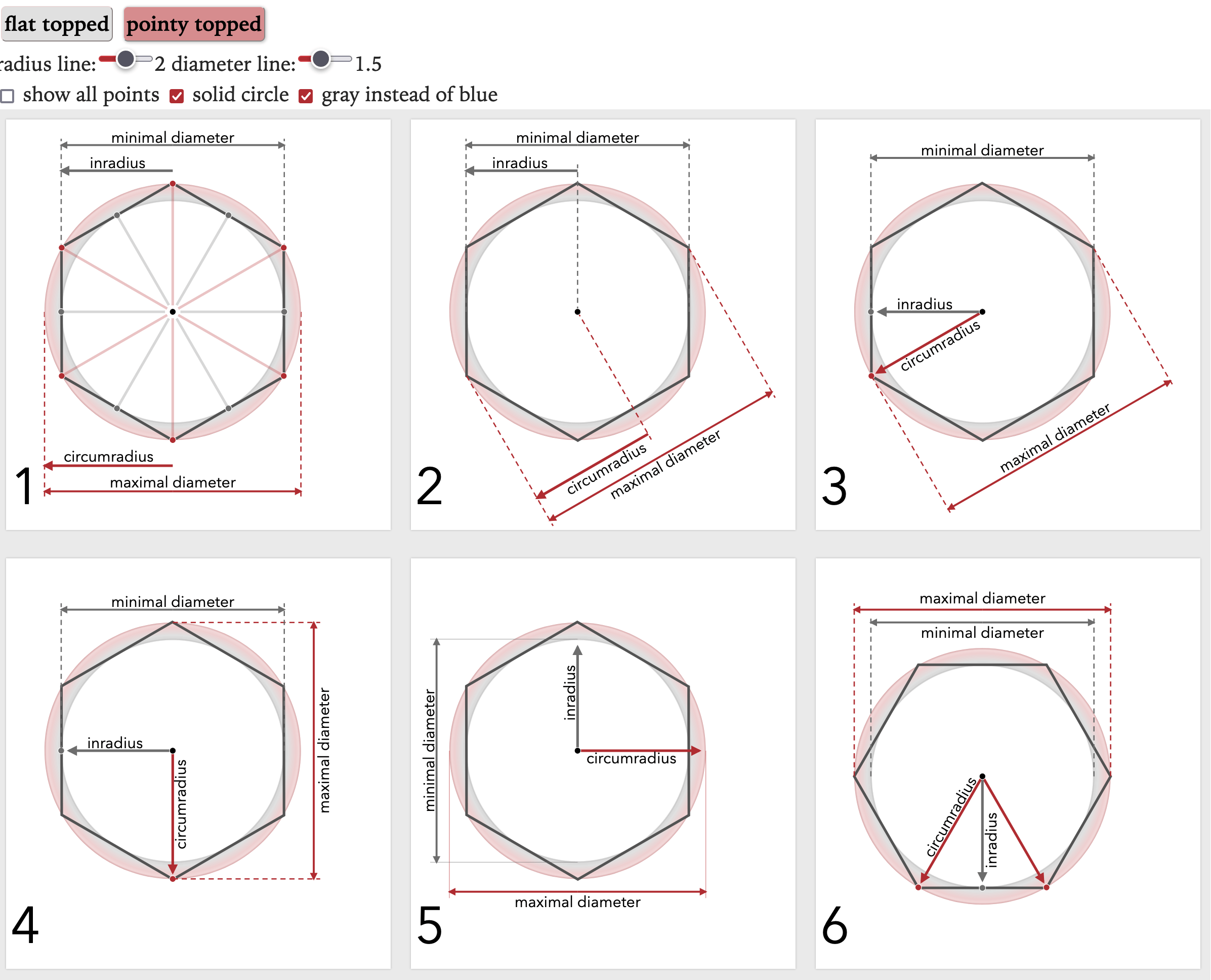
Now that I know the diagram's purpose — to show the sizes of a hexagon (size, circumradius, inradius, minimal diameter, maximal diameter, width, height), I made a list of things to look at:
radius label placement:
- the extra spokes aren't needed for the width/height
- having the radii labels inside the circle feels nicer than having them outside
- having them close to each other makes it easier to compare
- having them at 90° allows them to align with width/height
- having them point up and right feels nicer than down and left
- the triangle shows how the two radii are connected, but this only works in pointy orientation
- diameter label placement:
- diameters next to radii (outside the circle) makes it easy to see that relation
- diameters (outside) far from radii (inside) gives the labels plenty of space
- diameters next to each other makes it easy to compare them
- angled makes it easy to toggle the hexagon orientation (pointy/flat)
- aligned with x and y axes makes it easy to see how they are width/height, but rotation is hard
- circle color:
- I had started out with the dashed lines because it matched the angle diagram
- I liked the solid version much better (thanks twitter!)
- other colors:
- I started out with red and blue to distinguish the two circles
- I switched to red and gray, as it matches the other diagrams on the page better
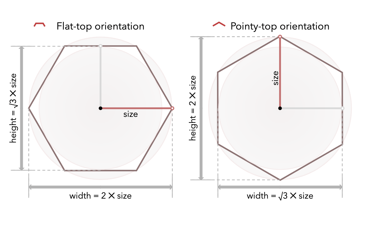
I can't get all the things I want in the same diagram. What do I prioritize? This diagram is about sizes. I decided I should prioritize the width and height of the hexagon. I put the radii inside, at 90°, pointing up and right. I put the diameters outside, at 90°, on left and bottom.
The rotation animation between pointy and flat orientations was going to be trickier, and I didn't implement it fully on the test page. I had been using rotation, but to make the diagram I wanted, the minimal diameter rotates left, the maximal diameter rotates right, the inradius rotates right, the circumradius rotates left, the hexagon rotates right. And then after rotation, the radius and diameter labels need to swap between being above to being below the line. Implementing the animation with all the details I want is a lot of work.
I ended up building a separate diagram for pointy and flat orientations. It let me hard code a lot of parameters instead of trying to smoothly animate them. It also lets the reader compare the two orientations.

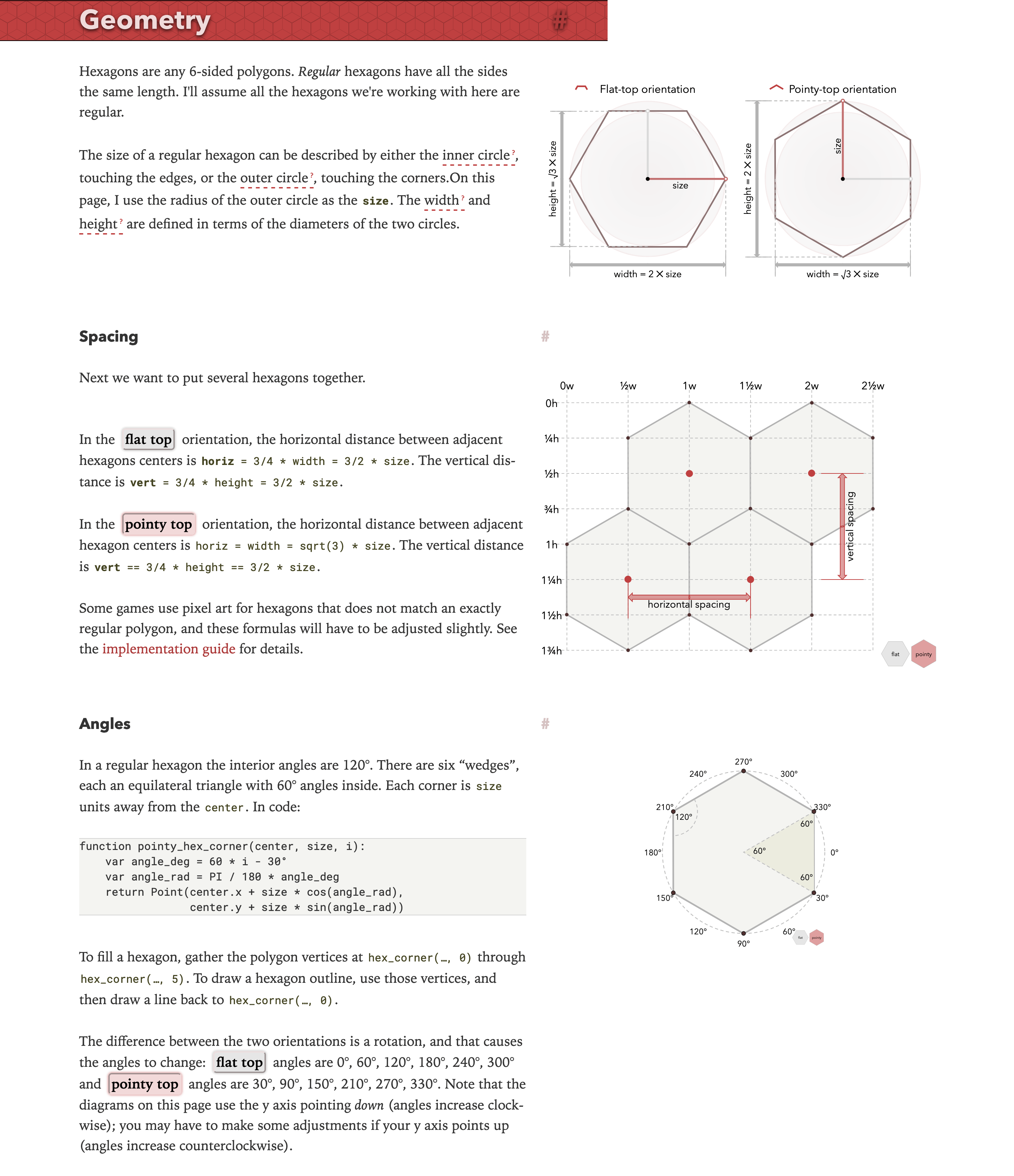
That becomes the new introductory diagram on the page. I'm much happier with the new page:

Post a Comment