When I started making interactive diagrams the hard part was making them interactive part. But over the years I've gotten much better at that. Now the problem is designing the diagrams. A few weeks ago I was looking at the beginning of my hexagons guide to see what I could improve. I noticed this paragraph had no corresponding diagram:
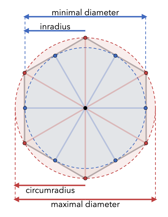
In math, the "circumradius" is the distance from the center to a corner (I call this size); the "inradius" is the distance from the center to the middle of an edge, sqrt(3/4)*size. The "maximal diameter" is twice the circumradius; the "minimal diameter" is twice the inradius. Wikipedia has more.
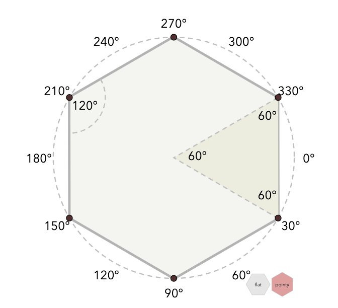
My first thought was to add a diagram for this. I already have a diagram about angles, so I could add a diagram showing the inradius and circumradius:


I made it similar to the angle diagram in that I used dashed lines for the circles and also the measurement lines. But I needed two circles. I ended up making them different colors.
I didn't like it. But I didn't understand why. So I asked Twitter, and got lots of feedback.
- Golan Levin suggested rotating the labels
- Mega Wolf also suggested rotating the labels
- Estevo suggested removing most of the dots
- curved-ruler suggested not showing all the radii
- Damian Connoly suggested vertical alignment
- Stanisław Małolepszy suggested two separate hexagons
- Scott Jenson suggested removing detail and moving the labels inside (and made mockups!!)
- Zaript suggested putting the measurements side by side to make comparison easier
- Golan Levin suggested showing the ratio of the two radii is 2/√3
- Blank suggested using one hollow circle instead of two dashed circles
- Rune Skovbo Johansen suggested rotating the radii to show the angle doesn't matter
- horse paste also suggested not using dashed lines
- Scott Jenson suggested getting rid of blue, and using dash styles
- Brendan suggested putting diameter lines on opposite sides
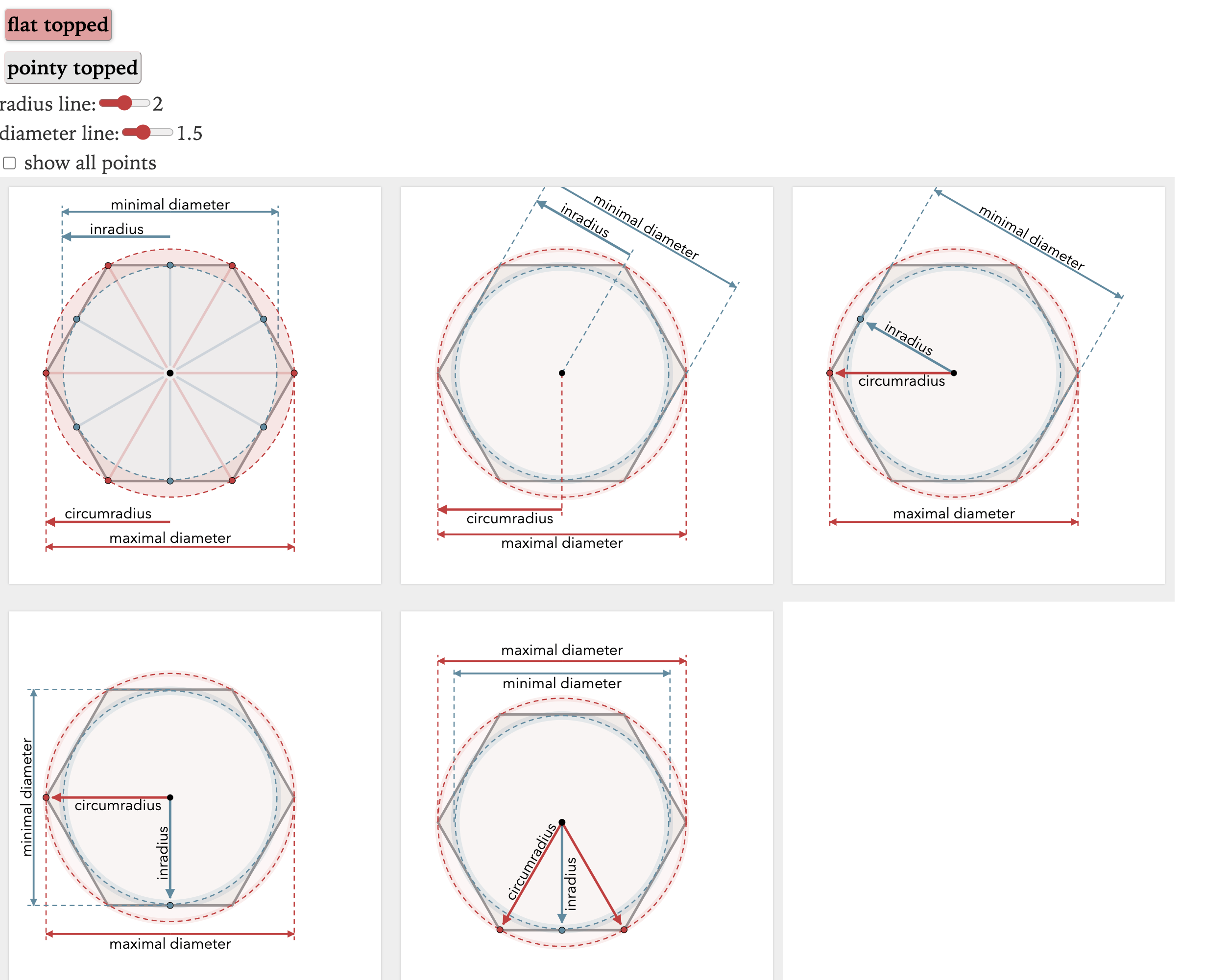
So that led me to try out lots of variants of this diagram.

But there are pros and cons to each of these. Which one should I use? How can I evaluate these designs without knowing the purpose of this diagram?
That's part two.
The original shows that each line to each center and each point is the same in a hexagon. I think I liked seeing those extra lines. But agree that for some reason having both labeled the way they are - I felt like it was difficult to see the difference between the two - the verbal description was easier to take in. (That the distance was from the center to the middle.)
Seeing the diagram label it outside of the graph using the circle instead of one of the actual lines made it challenging to follow for me.
Thanks for the feedback! Not only are the lines to each point the same length, but they also match the sides of the hexagon. I kind of want to show that too. It means we have lots of equilateral triangles, and we can use that triangle height to see how the circumradius and inradius are related. There's a lot of good stuff that I don't have in the current design and I might add that back in a separate diagram somehow.
Post a Comment