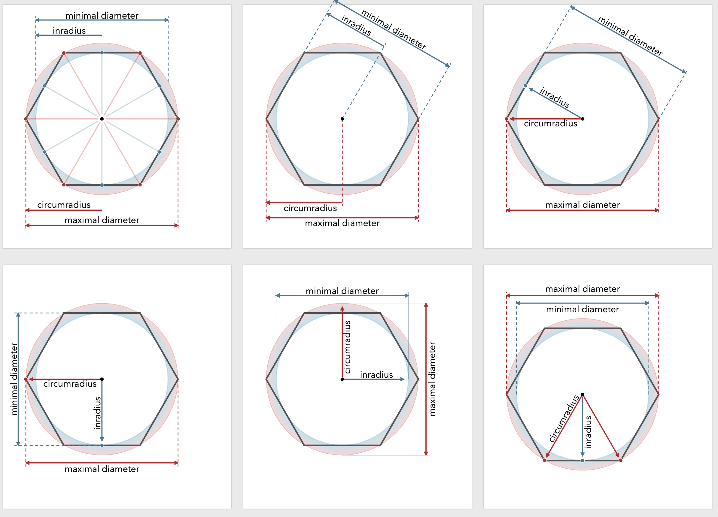
In part one, I described how I created lots of variants of a diagram to try to figure out which one to use on my hexagon guide.

This diagram fits in between the "math" part of the page and the "size and spacing" part of the page. The link to the math part is that I'm using the math terminology here. But the purpose is to link the math to the practical considerations of a hexagon grid. The reader wants to know the width, height, horizontal-spacing, and vertical-spacing for a hexagonal grid. Those values are derived from the four measurements in the new diagram.
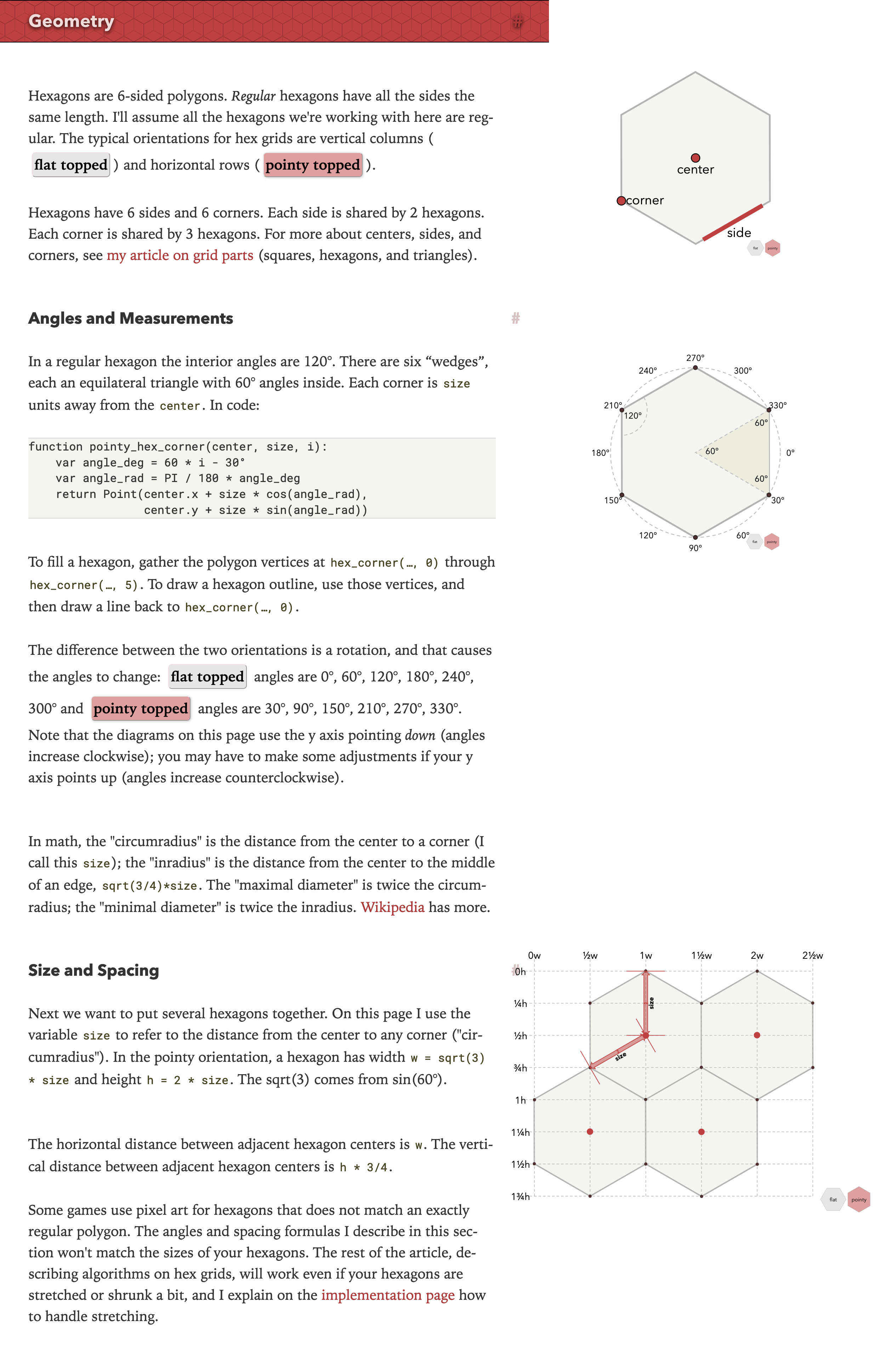
Trying to figure out the purpose of this page made me realize I don't like the beginning of the page at all. Let's take a look:

I added the new diagram, but then I started thinking about why I don't like this section of the page. It starts out showing the reader what a corner and edge of a hexagon is. Do I really need to explain what a corner is?! Why is that even there?
The hexagon page grew out of my 2006 page about centers, corners, and sides of a grid. The introductory diagram was vestigial, reflecting the history but not the current content of the page. It doesn't need to be there anymore.
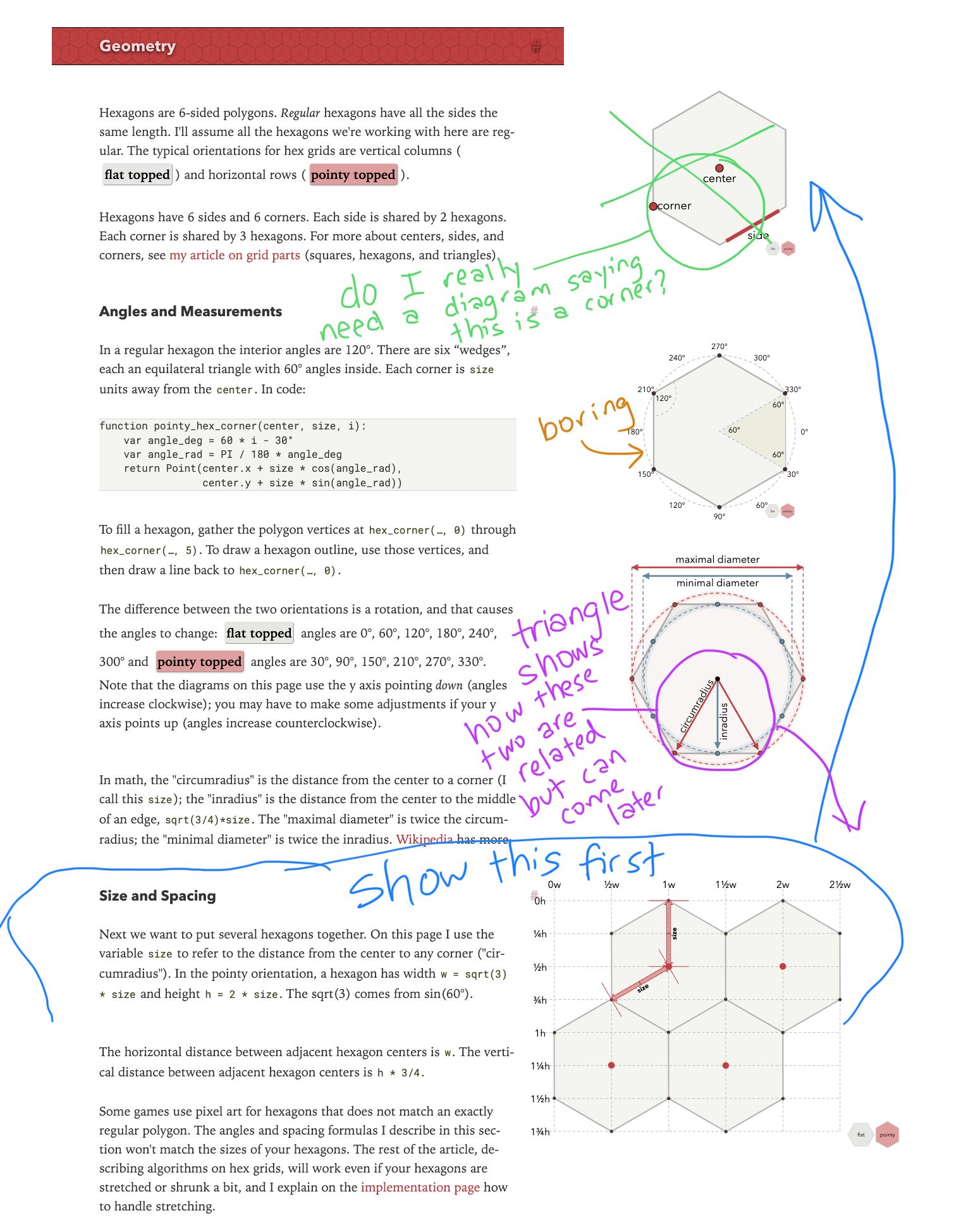
I scribbled some notes on the page:

- Remove the center/corner/side diagram. It belongs on a different page, or in one of the later sections of this page.
- Remove the boring angle diagram. Or at least move it down to later. It's hardly the first thing I want to see.
- The new diagram is a math definitions diagram. It's not very useful unless you already know the math.
- The last diagram is what I want to see first!
The most important diagram here is the size/spacing diagram at the bottom. I want to put it at the top. But that diagram has issues. It serves two purposes. One is the width/height of a hexagon. The other is the spacing of a hexagon in a grid. The problem is that the diagram doesn’t show both at once. Instead, you have to hover over text of the page (not something you’d ever discover) to see the diagram switch between modes. Even worse, it shows neither mode when you load the page.
This topic is important enough that I shouldn't hide it behind a hover action. I decided to make it two separate diagrams.
- The first diagram will be about size. The new diagram can serve that purpose: size (circumradius), width, height. The math names (minimal diameter, maximal diameter, inradius, circumradius) are less important.
- The second diagram will be about spacing. It will look very much like the current size/spacing diagram, but won't have hidden modes. It will always show spacing.
I think this section of the page will be much better with these changes! And I now have a purpose for the new diagram. It will be about size. And now that I know the purpose of the new diagram, I can evaluate all the designs I had come up with. That'll be in part three.
Post a Comment