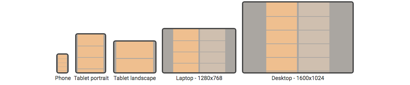
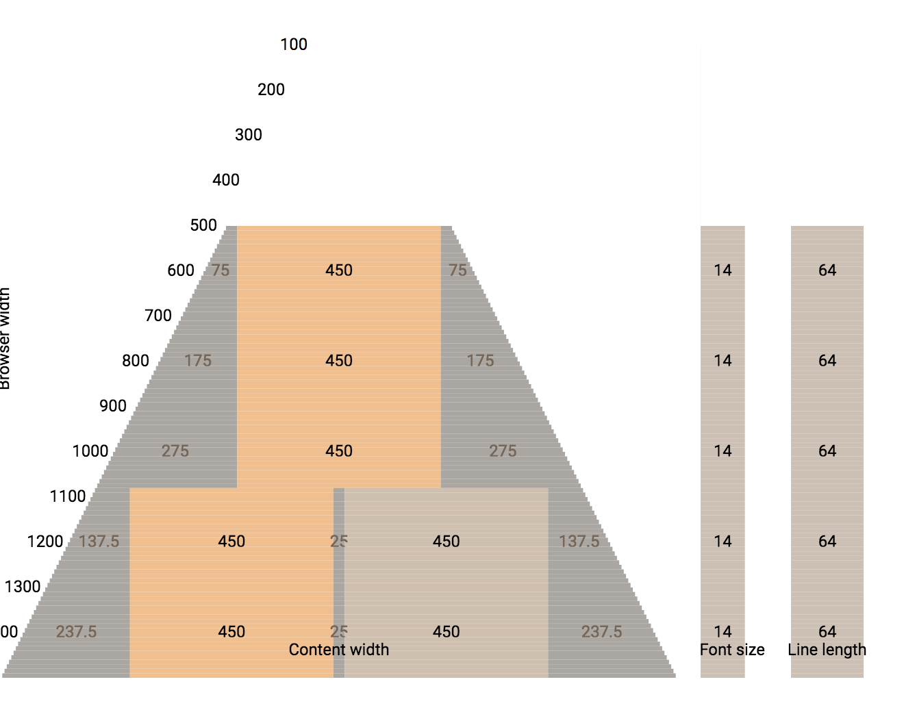
In my last post I said I was going to update my website layout. I've been working on it for the past three weeks . The main change is responsive design: the page will adapt somewhat to the size of the browser window, including phone and tablet sizes.
Of approximately 600 web pages, I have 514 converted to the new layout. The rest are either unimportant or impractical to convert.
To help myself understand the issues, I made some diagrams:
I wrote up my notes about how I made the pages responsive.
I also fixed some glitches on my pages, and switched from downloaded fonts to system fonts (to make the page load faster).
For testing, Firefox's screenshotting tool and Chrome's screenshotting tool were both useful. I took screenshots before and after a change, and then reviewed the pages when screenshots changed.
# Firefox
/path/to/firefox \
    -screenshot \
    --window-size=$width,4000 "$url"

# Chrome
 /path/to/chrome \
     --headless --disable-gpu \
     --window-size=$width,4000 \
     --screenshot "$url"
Labels: design , infrastructure
Side note: it sure would be nice if I could somehow edit my blog posts locally, but I don't see a way to do that with Blogger :-(
Post a Comment