In the previous post I described how I redesigned some of the diagrams on my circle drawing page. I found that I had been reusing code in ways that made the diagrams worse. I switched to more copy-paste programming to make the diagrams better.
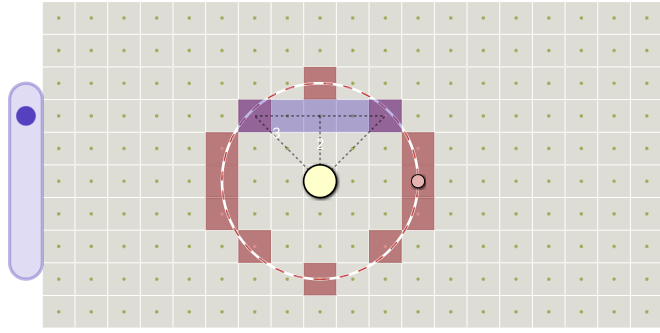
Outlines: this was a mess. I was trying to show both the algorithm calculations (white, black, purple) and the output (red) in the same diagram. The labels were unreadable. I couldn't figure out what to do, so I decided split this into two diagrams. Sometimes it's easier to solve two smaller problems.
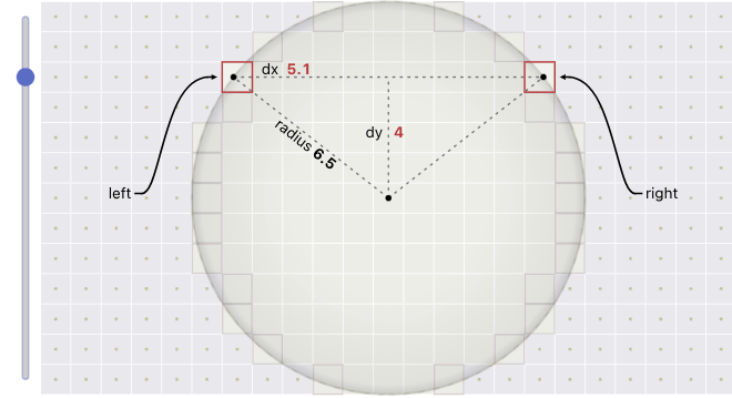
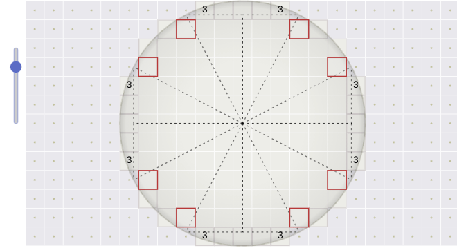
This diagram shows how the algorithm works. As with the previous diagram, I removed the control over the center and radius, and instead used a large fixed radius that would allow me to add more labels. I added labels corresponding to variables from the code: dx, dy, radius, left, right. I changed the slider to look more like a normal slider control. I used red sparingly, just for the output and main calculations. I also added a faint version of the output, but I think it might make the diagram too busy.
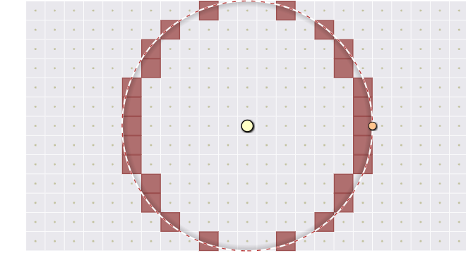
The second half of this diagram shows the output, in the same style as the output diagram at the top of the page. I think this diagram makes it much easier to see that the algorithm doesn't work right. It leaves gaps at the top and bottom. Fixing that issue is the motivation for the second algorithm.
The diagram for the second algorithm was even more of a mess. I proposed a fix that involved iterating both over rows and columns, so I added a second purple bar to show the columns. The first purple bar has the right triangles but the second bar doesn't. It's inconsistent and also hard to read. I was quite unhappy with this diagram.
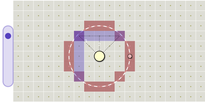
I initially used the same design as the previous algorithm. I wanted to show the right triangles. But then I realized it would be simpler to calculate all 8 corners at once instead of just 2 or 4. I showed all 8 right triangles and all 8 outputs, and I shrunk the slider to the minimal range necessary. Thinking through this diagram helped me simplify the algorithm! I added the distances, which correspond to the r variable, but I am not quite happy with the placement. That's a problem for another day. It's a web page. I don't need wait until it's perfect; I can keep updating it in the future.
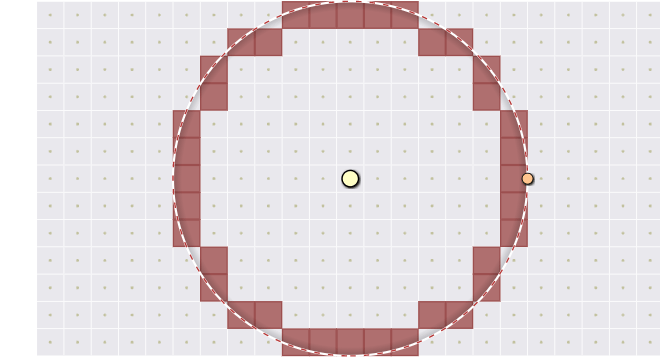
The separate diagram showing the output is much cleaner than trying to mix the calculations and the output in the same diagram. I added back the control over the center and radius.
In redesigning the diagrams, I cleaned up the code, and it ended up fixing a glitch in my previous code. There was a weird corner effect at radius 4, which you can also see on Linus Arver's blog. In my new code, that glitch is gone. I don't understand the cause or the cure but I'm not going to worry about it.
Adding more stuff is the default way I think about solving problems. Sometimes I need to subtract to solve the problem. I saw this on all the diagrams — I started with the clean diagram at the top of the page and added distances, the bounding box, the purple bar, the right triangles, the slider, a second purple bar, etc. But I never removed anything. And that made the diagrams more and more cluttered. In the redesign I removed some elements and I think the diagrams are much easier to understand now.
Another thing that this process reminded me of is that flexibility is often "fluid" in that adding flexibility in one place removes flexibility in another place. For example, removing the reader's flexibility to move and resize the circle added the flexibility for me to add labels. Design of interactive elements is about choosing what can vary and what is fixed. The fixed parts allow elements that may be impractical when everything can vary.
I had originally planned to spend a day or two on adding the outline section, but I ended up spending a few weeks on diagram design. I'm glad I did. I'm much happier with the new diagrams. Take a look at see what you think!
Labels: design
Post a Comment