Linus Arver's post about circle drawing reminded me that I wanted to add circle outlines to my circle fill page. My page is focused on circle fill rather than outline, but one of the fill algorithms can be adapted to generate outlines instead. I added a section on circle outlines, reusing the code from the circle fill diagrams. Unfortunately … I didn't like the result.
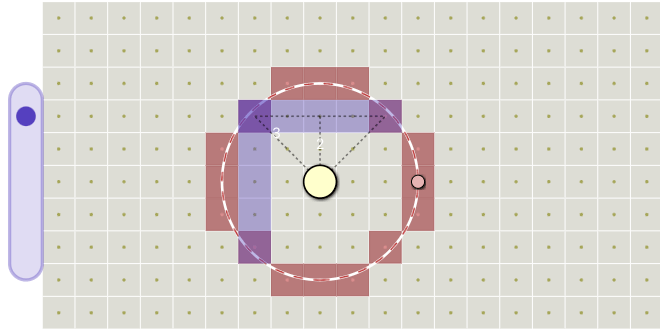
This led me to look at all the other diagrams on the page, and I realized I didn't like some of the other diagrams either. After tweeting about it I got some suggestions, and I decided I would revisit all the diagrams on this page.
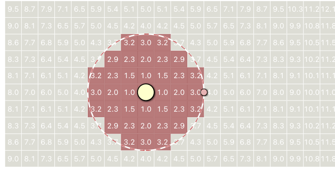
I started with the distance diagram. What's wrong with this? The biggest problem is that the text outside the circle is hard to read! What was I thinking?! A less obvious problem is the the use of color. I'm using red to show the output of the algorithm. This is the natural thing to do, as I already had a diagram earlier on the page that did this, and I reused the code. The goal of the earlier diagram was to show the output of the algorithm, and the red directly matched the goal. The goal of this diagram is primarily to show distances, and secondarily to distinguish distances ≤radius vs ≥radius. I redesigned the diagram:
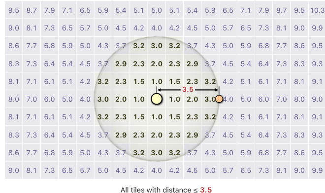
The red area was barely serving the goal of this diagram. It shows the area where the distance is ≤radius vs ≥radius, but it doesn't emphasize the distances part. So I took out the red background. The main goal is to show distances, so I made all the distances readable. The secondary goal is to distinguish the lower and higher distances, so I used both color and bold for this. To help distinguish even more I used warm vs cool colors, both for foreground and background. I added a dimension line to show the radius visually. I also put the radius in the caption under the figure. I don't think it's great but I think it's much better than before.
I then moved on to the next diagram, bounding boxes.
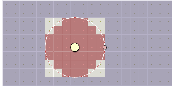
This diagram shows an optimization: we only have to calculate the distance for tiles inside the bounding box. But how did I use color here? I used red (reusing the previous code) for the output of the algorithm, and I used purple to show the tiles outside the bounding box. I didn't show the distances here, so this diagram felt a little disconnected from the previous one.
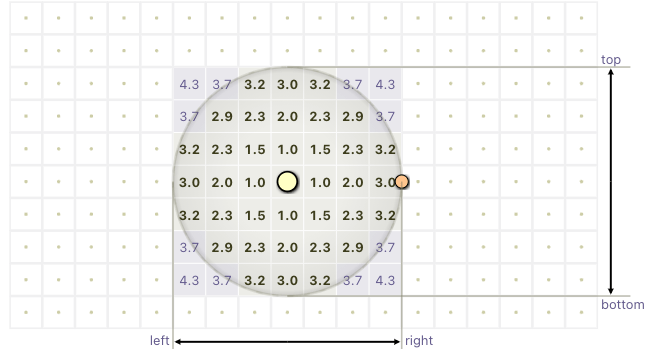
I tried to make this diagram look similar to the distances diagram, since it's an optimization over the previous algorithm. I took out the red and the purple. I added distances back in. The presence or absence of a distance tells you whether the algorithm calculated that distance. The code calculates left, right, top, bottom, and I showed those visually, with labels. Compared to the previous diagram, I took out the measurement, because the radius isn't the focus of this diagram.
I'm much happier with the new diagram than the old version, but there are still some things I haven't gotten right. For instance, the ranges are inclusive, left ≤ x ≤ right and top ≤ y ≤ bottom, but the diagram makes it look like the endpoints are on edges, when they're actually on tiles. But I don't need the diagram to be perfect before I put it up. I treat my pages as continual improvement rather than getting everything right all at once.
The third diagram I wanted to fix was showing the bounding circle algorithm:
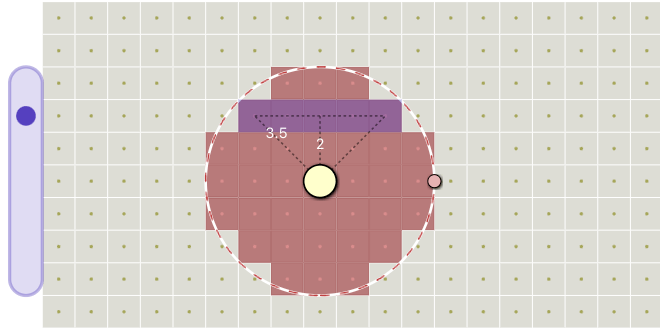
What's wrong with this one? The same old issue: I had reused the first diagram on the page, which used red to show the output of the algorithm, but the most important thing in this diagram isn't the output. I think the numbers are readable, and the triangle is reasonable, but I wanted to redesign this without the red.
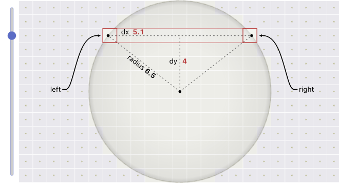
In the new design, I used red for the main idea in this algorithm: the span between the left and right points on the right triangles. I think the triangles are easier to see now. I decided that moving the circle around was not meaningful here, so I took that control out. A bigger change was that I decided that resizing the circle was not worth the complexity, so I took that out too. The explanation of how the algorithm works isn't meaningfully different at different sizes of circles. Removing those controls allowed me to implement better labels, and I think labels improve this diagram much more than those two controls.
One unexpected side effect of reviewing the diagrams is that in making the diagrams and code match, I improved both the diagrams and the code. The sample code is now cleaner and more precise.
After working on these diagrams, the next step was to get back to the diagram that I was most unhappy with: the explanation of the outline algorithm. That's the next blog post.
Labels: design
Another amazing post. This is great for educators to think about how their diagrams impact their students. I love your observations! I have to also note, that I learned a even more seeing the reasons for the changes, it made it crystal clear what I was supposed to take away from the diagram.
Thank you NYCynik!
Post a Comment