A few weeks ago a reader suggested the labels on my hex diagrams for the "cube" coordinate system could be improved. I took a look at what I had:
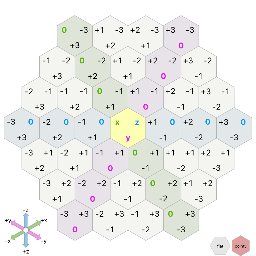
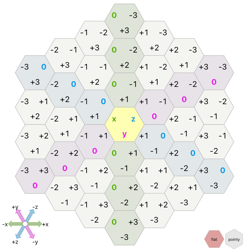
They're … inconsistent. In the pointy hex layout they're in corners and in the flat hex layout they're on edges. These labels don't rotate with the grid. They also don't correspond to the direction of the coordinate axes. In the pointy layout, the x label points towards +y, y towards +z, and z towards +x. In the flat layout, the x label points towards z=0, y towards x=0, and z towards y=0. The one nice thing about these labels is they start with x being on the left, which feels familiar.
I tried an alternate layout, putting the labels in the +axis direction, so for example the +x label will be in the same direction as the +x axis:
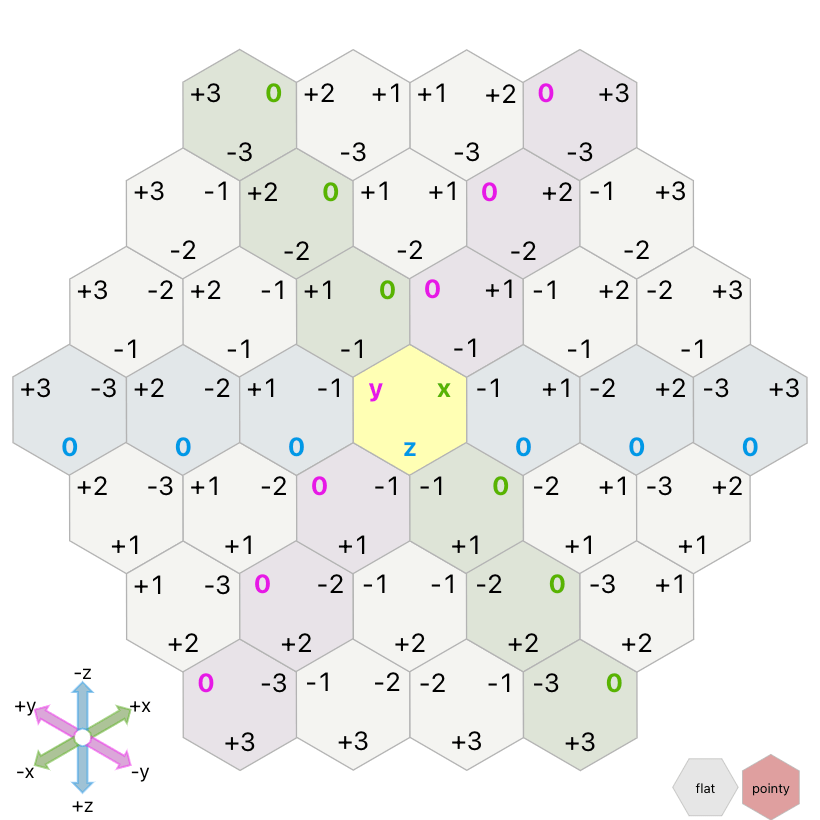
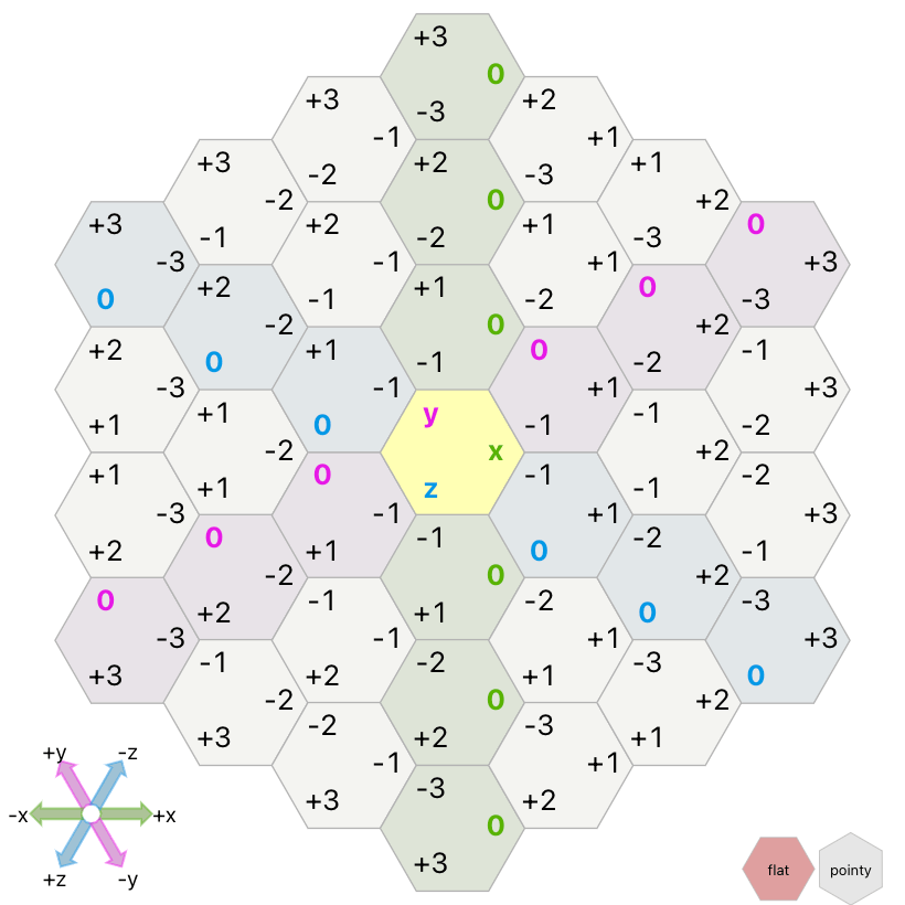
I liked this and asked for opinions on Twitter. They were mixed. One of the problems is that the labels put x on the right, which feels wrong. Another problem is that the labels correspond to the axes in the lower left corner, but not to the colored 0-valued hexagons. This is actually a very confusing aspect of hex grids, which I haven't yet come up with a diagram for.
So I tried another idea suggested by a reader: placing the labels on the edges of the hexagons instead of the corners, lined up with the 0-valued hexagons of that same axis:

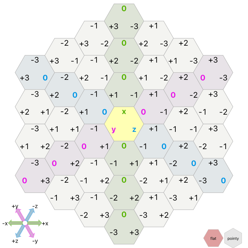
None of these systems has everything I want:
| what I want | old | corners | edges |
|---|---|---|---|
| nice label order | yes | no | yes |
| rotates with grid | no | yes | yes |
| label matches axis | no | yes | yes |
| label points at +axis | no | yes | no |
| label matches other colors | no | no | yes |
However, regular cartesian coordinates don't have everything either. In (x, y) we read x first but then the +y axis is up and +x axis is right. I decided to go with edge label option. It most closely matches cartesian coordinates. We read x first but the +x axis is right.
Take a look at the new labels and let me know what you think.
These types of design changes remind me why I write web pages instead of making videos: I can keep improving these pages over time as I learn more and also based on reader feedback. I care a lot about longevity. I want to make things that keep getting better over time. It's also why I try to write on the web instead of on Twitter. Not only can I not improve my tweets, I feel like my tweets will get read over merely a few days, but my web page will be read over ten thousand days.
Post a Comment